

Note: You may filter by category below. To use search feature for all categories return to main blog page here.
Garden Design: Color Theory for Artistic, Emotional, and Ecological Impact
This page contains affiliate links and was updated on 11/2/2023. As an Amazon Associate I earn from qualifying purchases.
On the journey to positively impact the local environment in my yard, I was excited to dig in and install a native pollinator garden in place of lawn areas when we bought our home. But I learned that there's an art to creating a beautiful garden space that nurtures our spirits too. That’s when I discovered color theory for garden design.
During the first spring season at my home, I went searching for native perennials for our DIY garden installation. I was looking for native plants that could make an ecological impact. Often, I could only find cultivars in the local nurseries, meaning, they are altered from the natural straight species. This typically means a characteristic change such as the color, the flower shape, or the size. With no real plan, I brought home the closest cultivars matching my original wish list so that I could get something in the ground that season.
Through lack of design and planning, I discovered that some flower colors clashed in the garden. It did not jive! Especially the cultivars that were bright pink next to a subdued golden yellow. It didn’t help that I went against common garden design rules and planted “one of this, one of that” based on whatever I could find in stock at retail nurseries. As a result, my garden was just random splashes of color. The individual flowers were beautiful, but the overall colors in the garden could grab your attention …and not in a good way.
My goal was to create a wildlife haven and create a little oasis at home. When seeking tips on how I could design a more cohesive garden space, I opened the door to the world of color theory. I hope you can learn from my mistakes and make the most of your garden investment by choosing plants that visually work well together while supporting the local ecosystem.
Therapeutic Gardens: A Space to Relax

A garden can be more than a pretty sight to see. It can serve as a place to quiet the mind and tune in to nature’s soundtrack. I realized that color plays a significant role in creating a space that is therapeutic, where I could escape the day’s worries. It’s a place where we can find those peaceful moments to observe the beauty of the blooms and all the life within the garden.
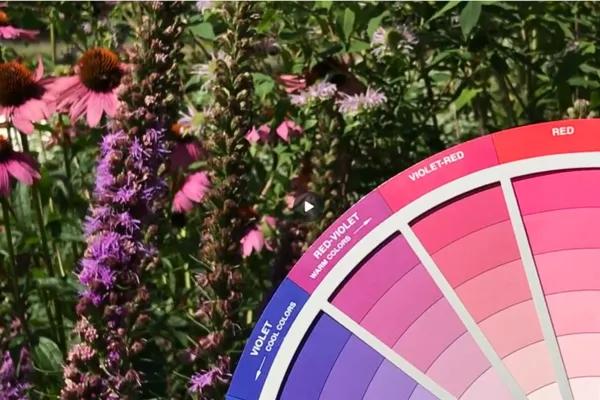
I then discovered a tool that would help me create the revised color palette for my garden oasis: a color wheel for gardeners. It takes the guesswork out of pairing plant colors. Color theory also ties certain colors to an emotional impact. We can design our gardens based on how we want to experience them. Yellow tends to create feelings of happiness and optimism. Purple is tied to spirituality and creativity. Red can be an attention-grabbing color, adding excitement.
The colors of my redesigned gardens welcome me to a tranquil space, while other areas use more energetic colors. Beyond color, life in the garden is just as therapeutic. The garden is not just a collection of plants; it is a living, breathing sanctuary. Stepping out the door to listen to the sounds of all the bees and wasps and watching the butterflies and moths float from flower to flower is the best of therapies.
Color Theory: A Wheel of Creativity

I became a student again when I wanted to understand how to design intentionally with color in my garden. You might recall learning about the color families sometime way back in your childhood art class. Here’s a quick recap about the color families:
Primary: red, blue, yellow
Secondary: orange, green, violet - made by mixing two primary colors.
Tertiary: the combination of the above, using one primary and one secondary color.
Neutrals: black, white, and gray, which is a mixture of the former two.
There are a few other terms to remind ourselves about that play into the color schemes we’ll look at next.
Tint: a color that has been lightened by adding white.
Shade: a color that has been darkened by adding black.
Tone: a color that has been mixed with gray.
Color theory is based on various color schemes, each with its unique characteristics and emotional impact. Close your eyes for a moment and imagine how you want to feel when looking out at or visiting your garden. Here are some of the most common color schemes and their associated emotions. Personally, I find it difficult to read about some of these combinations without a visual example. I’ll describe them below, but when you have a color wheel like this one, there’s no need to remember the combinations. Instead, you just look at the wheel and it’s all marked out on it. If you’re short on time, you can scroll to the video further below.
Monochromatic:
A single base color and its various shades and tints. Invites a sense of calm and simplicity. Creates a harmonious and soothing atmosphere, well-suited for spaces where relaxation and tranquility are desired.
Complementary:
Pairs of colors that are directly opposite each other on the color wheel, creating contrast (i.e. yellow and violet). This scheme is dynamic and energetic, where the contrast between colors makes them visually striking and vibrant. They can create a sense of excitement.

Pictured above: New England Aster (Aster Novae-angliae) paired with Showy Goldenrod (Solidago Speciosa) is a beautiful complementary color scheme in my garden in the fall.
Analogous:
Colors that are adjacent to each other on the color wheel, such as blue, green, and yellow. These colors share a similar hue. Analogous schemes offer a sense of harmony and unity. They are often calming and comfortable, making them suitable for creating cohesive and relaxing color combinations.

Pictured above: During the summer this area of my garden showcases an analogous color scheme using orange, yellow-orange, and orange-yellow from the color wheel. These blooms include Butterfly Milkweed (Asclepias Tuberosa), a cultivar of Tickseed (Coreopsis), and a cultivar of False Sunflower 'Summer Nights' (Heliopsis Helianthoides).
, and Blazing Star (Liatris Spicata) for garden design")
Pictured above: Another combination of summer blooms in my gardens includes a cultivar of Echincea, Bee balm (Monarda Fistulosa), and Blazing Star (Liatris Spicata).
Triadic:
Uses three evenly spaced colors on the color wheel, such as the primary colors. This scheme provides a balanced contrast that is vibrant and lively, offering a dynamic and well-balanced visual. They can create an atmosphere that is both exciting and harmonious.
Split-Complementary:
Combines a base color with the two colors adjacent to its complementary color. An example would be blue as the base color, with red-orange and yellow-orange. This scheme strikes a balance between the strong contrast of complementary colors and the harmony of analogous colors. It offers both excitement and a more balanced effect. Again, a color wheel really helps with imagining this one and the next!
Garden Redesign

Pictured above: The early spring blooms of Wild Blue Indigo (Baptisia Australis) pair well with Wild Lupine (Lupinus perennis) and the cheerful yellow of Golden Alexander (Zizia Aurea) in the background.
The guiding principles of color theory helped me work through my garden's redesign. I’m a visual learner, so it was much easier for me to learn these schemes by having the color wheel in hand because of the graphics and windows on the wheel. When I read about them I have a harder time envisioning them. Instead, I could walk out to my garden with the color wheel and see what tint or shade the bloom was, or use photographs online to get a pretty close match. Using a color wheel can help you view your garden bed as a canvas, and each plant as a stroke of paint.
Applying the Color Wheel
To get started with your unique DIY design, you could choose a color palette based on a certain emotion you want to experience. Or, you could choose your favorite color or favorite flower, and then pick a coordinated color scheme. Once you make the first decision, it is easier to make the rest of your flower selections.
Once I chose some key native perennials for my garden I started saving possible flower combinations to pair with those. I saved an image of the flowers in my phone and grouped each garden in albums. This helped me imagine what they could look like together in the garden. This created a nice visual to make sure I was staying within the chosen color scheme.
I also considered the time of year that flowers would be blooming, so that there would be color in the garden and food for pollinators throughout the seasons. I was aiming for the yard as colorful art while making a positive ecological impact. Organizing your photos in the order of bloom time helps plan for continuous color. This can help you avoid filling your garden with only spring-blooming plants. Instead, you want to keep the party going!

Image Above: The native perennial Dwarf Crested Iris (Iris Cristata) is a beautiful early spring bloom to celebrate the arrival of warmer weather in the northeast.
If you are looking for more inspiration, take a look at Mother Nature’s color palette. Find a natural field or forest and get to know which blooms are native to your area. Look for conditions that are similar to where your garden will be installed. Where we find native perennials growing together out in the wild we can study those combinations and see what works well. A lesson I learned is that some cultivars are of a color that is far off from the original straight species. In some cases, this created an undesirable clash effect in my garden. The straight species colors often play well with others. Take notice of which flower colors exist naturally. What feels right for your own garden?
By applying the principles of color theory, you can set the emotional experience of your outdoor space. You can step into the shoes of an artist, creating a beautiful landscape for you, your family, and your neighbors to enjoy. Plus, all the local pollinators will love your new garden!
Pollinators: Color as Survival

Image above: A small bee visits one of the first spring blooms in the garden, Golden Alexander (Zizia Aurea), which is native to my region.
I wanted my garden to be more than just a visually pleasing space. I wanted it to come alive with the soothing hum of bees, the energy of butterflies, and the soundtrack of songbirds. So, I set out to understand the language of color that these pollinators spoke. Some gardens include deep purples and bright yellows. Others combine bright red with shades of pink, and white blooms for added contrast.
Birds, bees, and butterflies navigate our world through colorful cues from petals and foliage. They use color as a map to guide them towards food sources and nesting sites. Color is not just about aesthetics. For pollinators, it's a matter of survival.
Bees, for instance, perceive a range of colors, but they are especially drawn to the blues, purples, and yellows of flowers. These colors serve as their beacons, directing them to abundant nectar and pollen. In this intricate dance, some pollinators, like bees, prefer to see masses of color. They've learned that where there's a profusion of blooms, there's a buffet of sustenance worth stopping for on their journey. Consider incorporating swaths of color to help pollinators navigate to the buffet waiting in your garden.

Image above: A hummingbird is drawn to the vibrant red native perennial, Cardinal Flower (Lobelia Cardinalis).
The world of pollinators is as diverse as the hues they perceive. Hummingbirds, for instance, have a unique relationship with color. They're attracted to bright reds, oranges, and pinks – a spectrum they can see with great precision. I love it when they zoom by on their way to the Scarlett Beebalm by our front porch. I learned that most insects cannot easily perceive red. It's the wonder of nature, where each species has honed its ability to decipher color. This is why I chose to install gardens that use different color palettes throughout my yard. By doing so, you can make sure there are nutrients available to a variety of birds, bees, and other insects.
In our gardens, pollinators teach us a powerful lesson – that color is a language of survival, a guide to nourishment and shelter. Observing them in the garden is a testament to the interconnectedness of nature. As a DIY garden designer, we can choose flowers that meet our aesthetic goals and the needs of these little beings we love to support and observe.
This is another reason to choose native perennials for our gardens because pollinators have evolved with these plants and rely on them for survival. By planting native species, you're extending an invitation to these important members of your local ecosystem. This results in a healthier, more sustainable garden, where life can thrive and perpetuate the circle of life.
Final Thoughts
As I look back on my garden design journey, I see my garden not only as a retreat but also as a celebration of the wonders of nature. It's a place where colors create artwork, life flourishes, and I’m always welcome to visit. It's a reminder that with the right color palette and a touch of inspiration, we can create our own vibrant oasis right at home. So, as I look out at my garden, I hope that my lessons learned will help you design your own sanctuary. For a quick recap, check out the video below. Get ready to dig in and make a meaningful impact on your patch of land, and all the life that comes to visit your garden!

To receive future blog posts click the button above to opt-in. I also invite you to follow me on my Facebook™ business page, and in the Sustainability & Wellness Seekers Facebook™ Group, linked here. You are welcome to join the community conversations!
Copyright 2023 Beth Manteuffel All rights reserved